Business Communication UX Case Study
Improving Smartphone Business Communication
The Challenge
Improve written smartphone communication for project orientated, business professionals.
Summary
I adopted a Design Thinking methodology. Beginning with research, I produced deliverables to inform the project’s direction, its users, and the users pain points. I was then able to generate ideas and iterate on those to create several prototypes which attempted to solve communicating technical information as accurately and efficiently as possible. The final product is a capable feature which can be integrated into the iOS platform or any smartphone application.
My Role
User Research
Ideation
UI Design
Prototyping
User Evaluation
Tools
Photoshop
Illustrator
Adobe XD
Initial user interviews to inform process
Process
This project is the outcome of the Interactive Design Foundation’s course— Become a UX Designer from Scratch. I started this project with no preconceived ideas, not knowing where it would lead me, or the results it would uncover. I employed the same level of effort, attention to detail and curiosity that I would with any other project. The objective was to explore each phase of the Design Thinking process and put into practice the lessons I had learnt
Persona developed from the initial interviews
Initial sketch of user Empathy Map
User Research
The audience I chose were professionals, aged between 30 and 40, who used mobile phones to conduct business. I began the process by interviewing two professionals; an engineer and an accountant. The results showed that written communication was responsible for valuable time being lost, frustrations due to poor communication, and a difficulty in communicating technical information to clients.
This initial research provided direction to create a user Persona and Empathy Map. These deliverables were invaluable references as they kept the user front and centre throughout the process. The Persona’s goals and motivations, paired with the empathy map, allowed me to place myself in the users shoes and imagine a scenario of working with vehicles while relaying technical information to a client.
First draft of Customer Journey Map
Updated Customer Journey Map
The persona and empathy map presented solutions to which written communication could be improved via a smartphone. An example was to merge imagery with text, in an ordered sequence, to visually communicate a story.
I now had a better understanding of who my target audience was and how they used smartphones to communicate. Using the Persona and Empathy Map, I sketched a brief Customer Journey to further understand the users pain points. I iterated the design after some reflection and found some opportunities. The smartphone contains several native features, such as a high resolution camera, markup tools, and an auto-correct. Using these features as inspiration, I could design a self-contained solution to communicate technical information.
SCAMPER exercise to generate ideas for the prototype
Ideation
The creativity began with a Scamper exercise. Using opportunities from the Customer Journey, I used the SCAMPER method to generate ideas for a smartphone solution. I had in mind that the solution would be a feature, but I did not know that it could reside within a dedicated application.
Preliminary - 1a
1b
Secondary - 2a
2b
2c
2d
I came up with interesting results using the SCAMPER exercise. With a business orientated audience, I found that this communication feature within a project tracking app helped business efficiency by collecting invoicing, tracking and communication within one channel. What’s more, the users need to communicate a series of events or instructions would serve better in an application, rather than unprofessional text messages or emails, which can quickly become unorganized and confusing.
It was time to put pencil to paper, but, by no means were my initial sketches elegant. I had an idea as to how the app’s communication should flow; I was desperate to get it onto paper. The preliminary prototype uses ‘hotspot’ notes, added to a photo the user took, which can be positioned wherever needed. These notes contain written information (rich text format) relevant to the location of the image. The purpose of this is to pair written content with supporting visuals to better communicate technical information; or information that would otherwise be difficult to communicate via phone, text, or email.
1a: Project photo taken
1b: User adds a Notes to photo
1c: Add note as ‘hotspot’ to image
1d: Note hotspot opens Rich Text field area
1e: Multiple notes can be added to any image
1f: Upload to business project
Prototype
Paper testing this prototype showed that limiting the amount of notes could have adverse effects to communicating effectively. I revised the prototype with a secondary, more ‘elegant’ rendition of the app. This time, the feature allows the user to add and navigate multiple notes within a single image. The possibility for communicating this way could open new opportunities, such as step by step progress of a project.
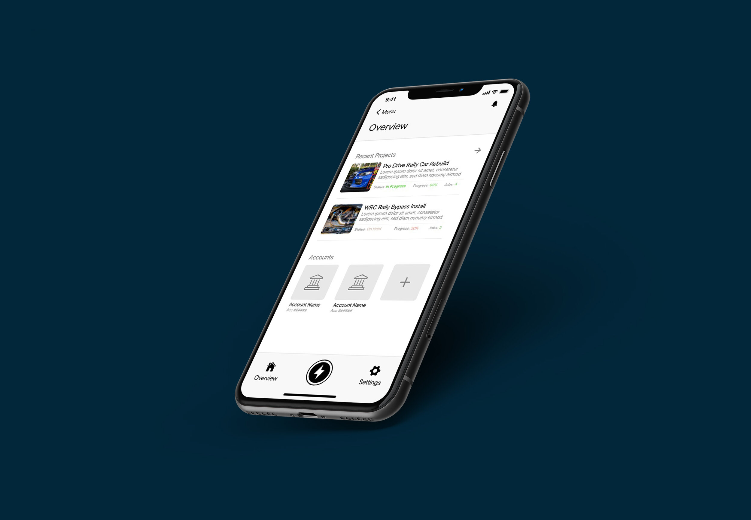
Using the revised paper prototype, I created a High Fidelity Prototype to put down a ‘finished’ looking product. This app has opportunity to develop into a comprehensive business application. The communication feature needs user feedback to iron out inconsistencies and determine if it is a viable solution for the target audience.
Takeaways
As a graphic designer by trade, I typically have an idea of how the end product should look or work like. Following the UX approach, I was uncomfortable starting off without an idea of the end product. This project encouraged me to trust the process, to put in solid research, and to investigate all outcomes.
The end result was surprising in its simplicity and its feasibility— use native smartphone features in a hybrid application to simplify written mobile communication. The next step is to test the solution on users to determine if the product is effective and how it can be improved.
Thanks for reading and please keep an eye out on this space.


